Stroke
Stroke
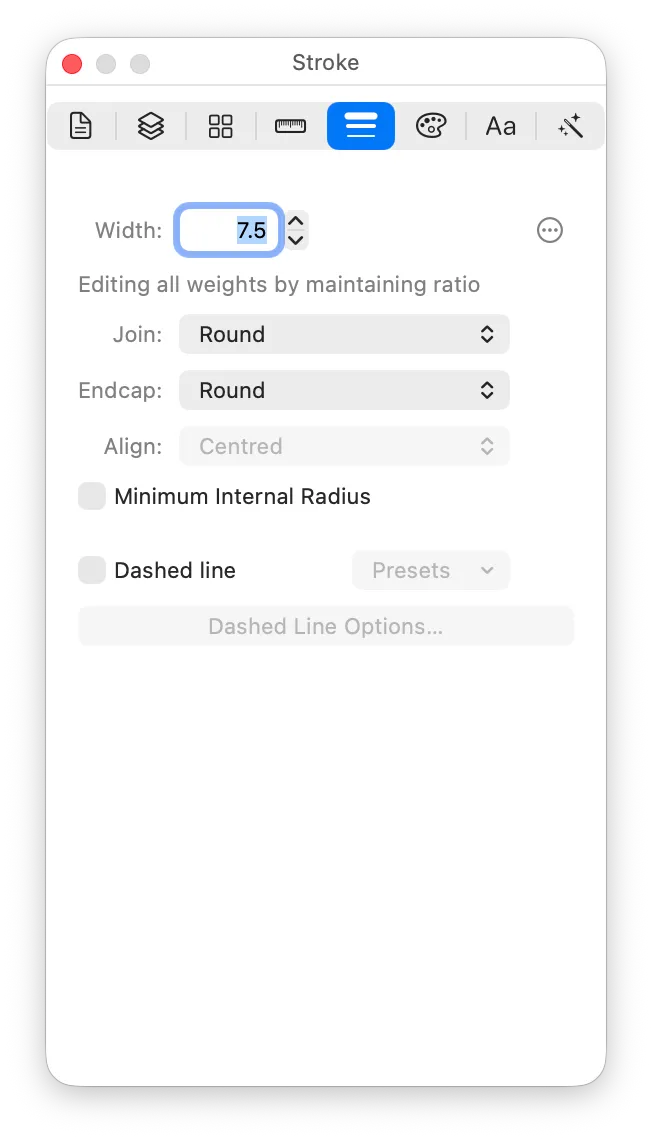
How the selected object’s stroke is drawn. The stroke’s colour lives on the Colour pane.
Width
The width of the stroke, in points.
Stroke width is the most common way of producing the different symbol weights. As such, the default stroke widths are shown here:
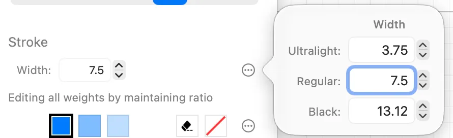
Unless you’ve unlinked the geometry for your selected object, then changing the stroke width in the inspector will change it for all weights, keeping the same ratio. You can edit it per weight using the divergence button to show the popover, or by unlinking the geometry for your object using the Link Geometry control on the canvas.
Join
How the stroke turns a corner: Round, Miter, or Bevel.
This describes how the lines that form the stroke are drawn where they meet. It’s not the same as your shape itself having rounded corners, which is a property of the geometry and lives on the Size & Metrics inspector.
Endcap
The style for line ends: Round, Square, or Butt.
Align
Whether the stroke is centred on the path, or sits entirely inside or outside it. Only closed shapes can take an inside or outside stroke.
Minimum Internal Radius
- Minimum Internal Radius affects how rounded are the internal corners of a stroke.
- It affects how the stroke is rendered, it does not affect the geometry of your path. In that sense, it is more similar in behaviour to a stroke’s join and endcap style, rather than to the Corner Radius property (which does affect the geometry). That’s why Minimum Internal Radius is on the Stroke inspector, whereas Corner Radius is on the Size & Metrics inspector.
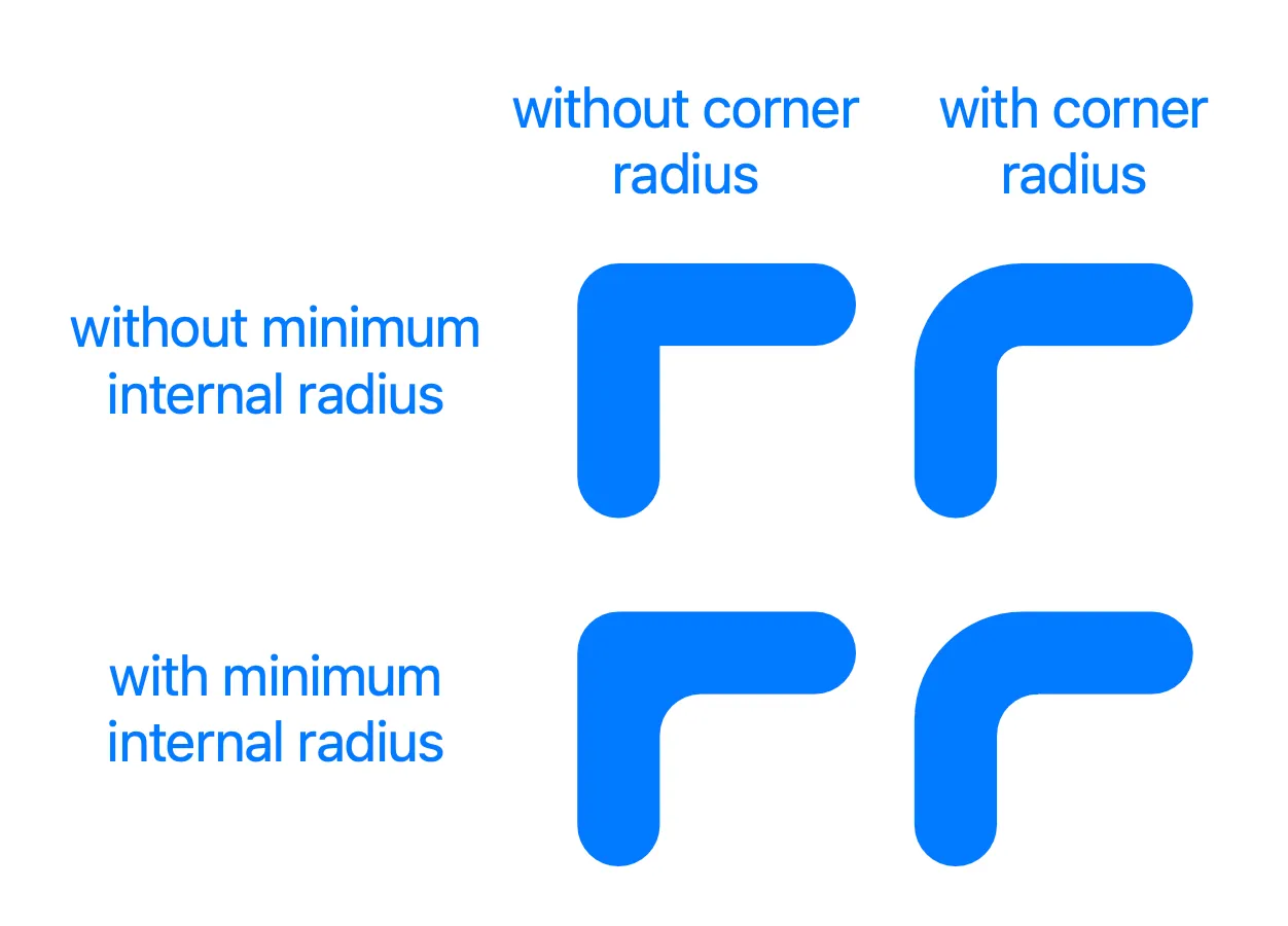
As you can see from the above chart, Corner Radius and Minimum Internal Radius can both be applied independently or together.
- Minimum Internal Radius can make corners look more pleasing by making the rounding look visually appropriate, rather than mathematically correct.
- When you apply Minimum Internal Radius to a stroked path or object, it applies to all corners and bends, including smooth curves.
- You can customise the Minimum Internal Radius for a single corner: enter the path’s Editing Scope; select the node representing the corner; double click on the corner radius handle for that node.
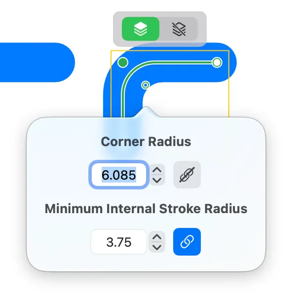
- In the corner popover, you can turn off the “Link” button for Minimum Internal Stroke Radius, and that will let you enter a value which applies to only this corner.
Dashed line
Dashed lines can be turned on by ticking the Dashed Line checkbox.
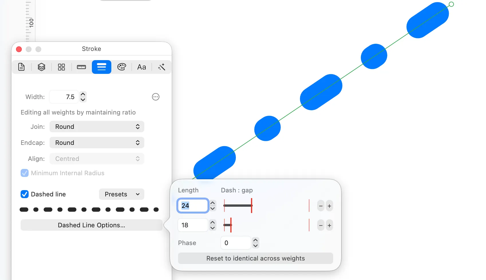
Dashed lines in an SF Symbol have some specific concerns. Due to the need to maintain interpolatable vectors, your line needs to have the same number of dashes. Whereas in other apps you might enter the length of a dash then the length of the space between dashes, in order to facilitate making interpolatable vectors, McKinley does things differently.
-
In the Dashed Line Options popover, you specify the length of each dash-plus-gap pair. (You can specify 1–3 pairs.)
-
Then, you can control the ratio of how much of each pair is dash to empty space.
-
The lengths of each pair apply to all weights (you can’t enter a different value per weight). However, there’s one gotcha: if your path itself is a different length on different weights, the dash/gap lengths are scaled to keep the same number of dashes in all weights. This is necessary for interpolation.
-
The ratio of dash to gap can be adjusted separately per weight if desired. (Use the Link Geometry control on the canvas to switch to Edit Only This Weight.) This is desirable because dashes may need a larger gap at Black symbol weight in order to look balanced. To adjust the ratio, drag the thick red vertical line. While you are dragging, the percentages of dash and gap are displayed.
-
In order to add or remove dash/gap pairs (between 1 and 3 pairs), use the minus and plus buttons next to each row.
-
The phase field controls where the dashes start along the stroke.